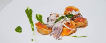
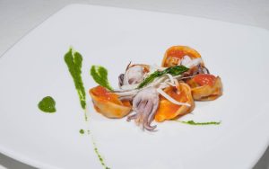
If you’re looking to make your food photography stand out and grab attention, then creating vibrant and colorful food flatlays is the way to go. The right combination of colors can evoke emotions, captivate your audience, and make your dishes look even more appetizing.
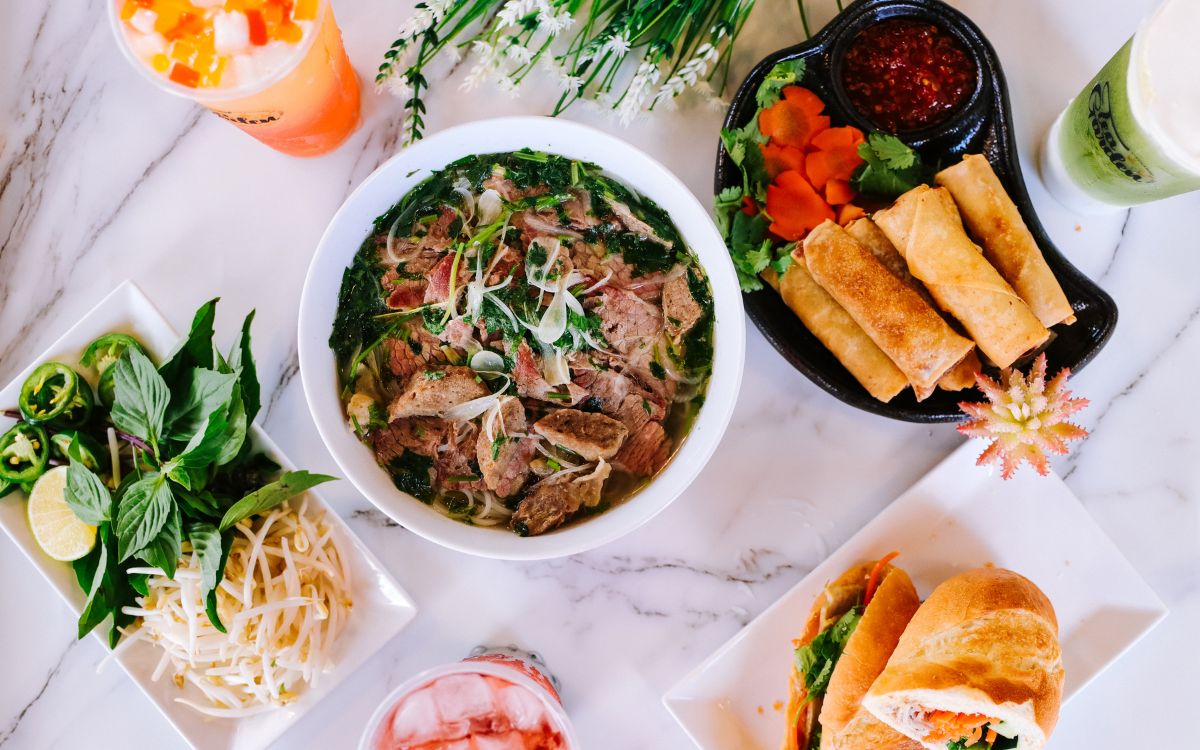
In this blog post, we’ll explore the art of crafting vibrant and colorful food flatlays that will leave your viewers in awe. From understanding the importance of color to choosing the perfect ingredients and props, we’ll guide you through the process of creating stunning flatlays that are bursting with life and personality.
Understanding the Importance of Color in Food Flatlays
Color is a vital element in food photography, as it has the power to evoke emotions, set moods, and create visually captivating compositions. In the world of food flatlays, understanding the importance of color and how to harness its potential can make a significant difference in the impact and appeal of your photographs. Let’s delve into the reasons why color matters in food flatlays and explore how it enhances the viewer’s experience.
The Psychological Impact of Color
Color psychology plays a crucial role in how we perceive and interpret visual stimuli. Different colors evoke distinct emotions and associations. For example, warm tones like red and orange can stimulate appetite and convey warmth and energy, while cool tones like blue and green can evoke a sense of freshness and tranquility.
By understanding the psychological impact of colors, you can intentionally utilize them in your food flatlays to create specific moods and elicit desired emotional responses from your viewers.
Enhancing Visual Appeal and Attracting Attention
Vibrant and bold colors have a way of capturing attention and enticing viewers. When used strategically in food flatlays, they can make the dishes appear more appetizing, fresh, and visually appealing.
Bright and contrasting colors create visual interest, drawing the viewer’s gaze and making the flatlay stand out among a sea of images. By incorporating eye-catching colors, you can make your food flatlays visually compelling and increase engagement with your audience.
Setting the Mood and Conveying a Narrative
Color can be a powerful storytelling tool in food flatlays. It can help set the mood and convey a narrative about the dish or the dining experience. For example, earthy and warm tones may evoke a cozy and rustic atmosphere, while pastel hues may create a soft and delicate ambiance.
By carefully selecting a color palette that aligns with the desired mood or narrative, you can enhance the storytelling aspect of your food flatlays and create a more immersive experience for your viewers.
Reflecting the Ingredients and Cultural Significance
Colors can also reflect the ingredients used in the dish and convey cultural significance. For instance, vibrant greens and yellows in a salad flatlay may signify freshness and healthfulness, while rich reds and purples in a berry dessert flatlay can evoke indulgence and sweetness.
Furthermore, certain colors are associated with specific cuisines and cultures. By incorporating these colors, you can visually represent the origins and flavors of the dish, adding depth and authenticity to your food flatlays.
Choosing a Color Palette for Your Food Flatlays
When it comes to creating visually stunning food flatlays, selecting the right color palette is essential. A well-chosen color scheme sets the tone, establishes visual harmony, and creates a cohesive and captivating composition. Let’s explore some key considerations and techniques for choosing the perfect color palette for your food flatlays.
Selecting a Theme or Mood
Start by determining the theme or mood you want to convey in your flatlay. Consider the overall atmosphere you want to create. Are you aiming for a vibrant and energetic feel, a serene and calming ambiance, or perhaps a rustic and earthy vibe? Understanding the desired theme or mood will guide your color palette selection.
Exploring Different Color Schemes and Their Effects
There are various color schemes to explore, each with its unique visual impact. Here are a few popular options:
Monochromatic Magic
A monochromatic color scheme involves using shades and tints of a single color. This creates a visually cohesive and harmonious look, highlighting subtle variations within the same color family. Monochromatic flatlays can exude elegance and sophistication.
Complementary Colors
Complementary colors are positioned opposite each other on the color wheel. Pairing complementary colors creates a vibrant contrast, making each color appear more vivid. This color scheme adds visual excitement and can make your flatlays pop.
Analogous Colors
Analogous colors are located next to each other on the color wheel. They share similar undertones and create a harmonious and cohesive visual experience. Analogous color palettes often convey a sense of warmth and balance.
Harmonizing with the Dish
Consider the colors present in the dish you are photographing. Select colors that complement and enhance the natural hues of the food. For example, if you’re styling a vibrant fruit salad, you might choose a color palette with analogous or complementary colors to amplify the freshness and appeal of the ingredients.
Considering Cultural Associations
Colors can carry cultural associations and symbolism. Research the cultural significance of colors in the cuisine or theme you’re representing. Incorporating colors that are culturally relevant can add depth and authenticity to your flatlays, connecting them to specific culinary traditions and creating a stronger visual narrative.
Incorporating Fresh and Vibrant Ingredients
When it comes to creating vibrant and enticing food flatlays, the selection of fresh and colorful ingredients is key. These ingredients not only add visual appeal but also enhance the overall freshness and appeal of your compositions. Here are some strategies and considerations for incorporating fresh and vibrant ingredients into your food flatlays.
Choosing Colorful Fruits and Vegetables as Focal Points
Fruits and vegetables are naturally vibrant and come in an array of beautiful colors. Selecting ripe and visually appealing produce as focal points in your flatlays can instantly inject life and vibrancy into your compositions. Opt for fruits and vegetables that are in season, as they tend to have the most vibrant and intense colors.


Exploring a Variety of Textures and Colors
Incorporate a diverse range of textures and colors in your flatlays to create visual interest and depth. Combine crunchy vegetables with soft and juicy fruits or pair vibrant greens with pops of bold and contrasting hues. Experiment with different combinations to find the perfect balance that complements your overall composition.
Layering and Arranging Ingredients
To create visually engaging flatlays, consider layering and arranging your ingredients strategically. Play with different heights, angles, and placements to create a dynamic and visually appealing composition. For example, stack slices of colorful fruit in a cascading manner or arrange a variety of vegetables in a visually pleasing pattern.
Adding Fresh Herbs and Edible Flowers
Fresh herbs and edible flowers are fantastic additions to your food flatlays. They not only introduce vibrant colors but also bring a touch of freshness and elegance. Sprinkle herbs like cilantro or basil over your dishes or strategically place edible flowers such as pansies or nasturtiums to add a burst of color and texture.
Considering Seasonal Elements
Take advantage of the seasons and incorporate seasonal elements into your flatlays. For example, in the spring, you can use blossoms or sprouting greens to convey a sense of renewal and freshness.
During the fall, you might opt for warm tones and autumnal produce like pumpkins or colorful root vegetables. By embracing seasonal ingredients, you can create flatlays that resonate with the time of year and enhance the overall visual impact.
Utilizing Props and Backgrounds to Enhance Color
Props and backgrounds play a significant role in food styling, as they provide opportunities to enhance the colors in your flatlays and create a visually compelling composition. Thoughtfully selecting props and backgrounds that complement and amplify the colors of your food can take your flatlays to the next level. Here are some strategies and considerations for utilizing props and backgrounds to enhance color in your food styling.
Selecting Props that Complement the Food
Choose props that harmonize with the colors of your dish and enhance its visual appeal. Consider the overall theme or mood you want to convey and select props accordingly. For example, if you’re styling a vibrant tropical fruit salad, opt for colorful bowls or plates that mirror the colors of the fruits. Use utensils, linens, and napkins in complementary or analogous colors to create a cohesive and visually pleasing composition.
Experimenting with Textures and Materials
Incorporating different textures and materials in your props can add depth and visual interest to your flatlays. Mix and match smooth surfaces with rough textures or combine matte and glossy elements to create contrast. For example, use a wooden cutting board as a background for a rustic feel or incorporate a reflective surface, like a metallic tray, to add a touch of glamour and shine.
Considering Color Wheel Relationships
Understanding color wheel relationships can guide you in selecting props that enhance the colors in your flatlays. Complementary colors, which are opposite each other on the color wheel, can create visual contrast and make the colors in your food pop. Harmonious analogous colors, which are adjacent on the color wheel, can create a sense of unity and balance. Experiment with different color combinations to find what works best for your composition.
Using Backgrounds for Contrast or Harmony
The background you choose can either create contrast or harmony with the colors in your flatlay. A contrasting background can make the colors in your food stand out and draw attention. For example, a dark background can make vibrant fruits or vegetables visually pop.
On the other hand, a harmonious background that complements the colors in your dish can create a cohesive and balanced composition. Consider using backgrounds in complementary or analogous colors to enhance the overall visual impact.
Composition Tips for Dynamic and Engaging Flatlays
Creating dynamic and engaging food flatlays goes beyond just arranging ingredients on a surface. It involves carefully considering the composition to guide the viewer’s eye and evoke a sense of visual interest and storytelling. Here are some composition tips to help you craft captivating and visually appealing flatlays.
Rule of Thirds: Balancing Elements with Gridlines
The rule of thirds is a fundamental principle in composition that divides your frame into a 3×3 grid. By placing your main subjects along the gridlines or at their intersections, you create a balanced and visually pleasing composition. Consider aligning key ingredients, props, or focal points along these gridlines to guide the viewer’s eye and add a sense of harmony to your flatlays.
Leading Lines: Guiding the Eye
Leading lines are lines within your composition that guide the viewer’s gaze towards a specific point of interest. Incorporate lines such as utensils, cutlery, or other props that naturally draw the eye toward your main subject. By strategically positioning these lines, you can create a sense of movement, depth, and visual flow within your flatlays.
Framing: Adding Depth and Focus
Consider using natural elements or props to frame your main subject. This technique adds depth and draws attention to the focal point. For example, you can use overhanging branches, plates, or other elements to enclose your dish and create a sense of intimacy. Experiment with different framing techniques to find what works best for your composition.
Symmetry and Balance: Creating Visual Harmony
Symmetry and balance can add a sense of order and visual harmony to your flatlays. You can achieve symmetry by placing identical or similar elements on both sides of your frame. Alternatively, you can create a balanced composition by distributing visual weight evenly across the frame. This can be achieved by adjusting the placement and size of ingredients, props, or negative space.
Depth and Layering: Adding Dimension
Creating depth and layering in your flatlays adds visual interest and engages the viewer. Place items at varying distances from the camera to create a sense of depth. Incorporate different heights and levels by stacking ingredients or using props of different sizes. This technique adds dimension and makes your flatlays more visually appealing.
Experiment and Play: Finding Your Style
Composition is a creative process, and there are no hard and fast rules. Explore different angles, perspectives, and arrangements to discover your unique style. Don’t be afraid to experiment, take risks, and push the boundaries of traditional composition techniques. By finding your voice and style, you’ll be able to create flatlays that are truly dynamic, engaging, and reflective of your artistic vision.
Conclusion
Remember, color plays a powerful role in food photography, evoking emotions and enhancing the viewer’s experience. By choosing a color palette, incorporating fresh and vibrant ingredients, selecting props and backgrounds wisely, mastering lighting techniques, and honing your composition skills, you can create flatlays that are truly works of art.